Thursday, December 13, 2012

SALLY MANN

 Of all the landscape photographs emulating Sally Mann's later work, this is my favorite. This photo was taken this summer, in the Galapagos, on a hike. The previous version is significantly different than this edited version because it was so colorful and bright. I added a Sepia affect, boosted the color, and blurred one half of the photo so that this photograph looked similar to Sally Mann's work.
 Although this photo is much brighter and perhaps simpler than Sally Mann's most famous work, there are still many similarities. Sally Mann mainly focused on photographing her family and children doing every day things. In this photo, I am doing Parvin's hair, which is also more casual. I like that we are not looking directly at the camera, even though most of Sally Mann's portraits of her children were looking at the camera.
 This landscape photograph was taken on a hike near my hour. I love the movement of the clouds in this photo, and how, even though the trees are in the center, there are a few more focal points. I also edited this photo to be black and white, and blurred the photograph to emulate Sally Mann's style of dark and imperfect landscapes.
 This photo was a very long editing process and emulates the work of Sally Mann that focused on faces. There are a few of her photos that only show one part of the face, for example the mouth or nose. I took a close up picture of the models skin, blurred it, and set it as the background. I then photoshopped only her mouth onto the skin background and blurred the edges so that it mostly blended into the background. I then clipped the outline of the tree and pasted it onto the background to make this photograph more complex.
 This photo is somewhat similar to the previous photograph of me doing Parvin's hair. Doing hair is an everyday event, and I like how Neff's hands look while she's braiding her hair. I darkened and edited the coloring of this photo so that it looked similar to the coloring and definition of Sally Mann's photographs. I also blurred the background so that the eye would mostly just notice Neff.
 This photograph of Eva at the top of a staircase does not emulate a specific photo of Sally Man, but I like how the lighting in the photo bounced off the walls, and, even though you can't see Eva's facial expression, she looks mad or alone. Anger or loneliness is a pattern in Sally Mann's earlier work.
 This photo was taken near my house. Before editing this photo, there was a beautiful sunset that made the trees appear black. The colors of the sunset did not show through with my edits, which makes the photograph more mysterious because the viewer may not be able to tell if it is day or night. I also blurred parts of the tries so that it looked more mystical. The blurring is not perfect, which i decided to embrace, similar to Sally Mann's perspective of imperfections in a photo.
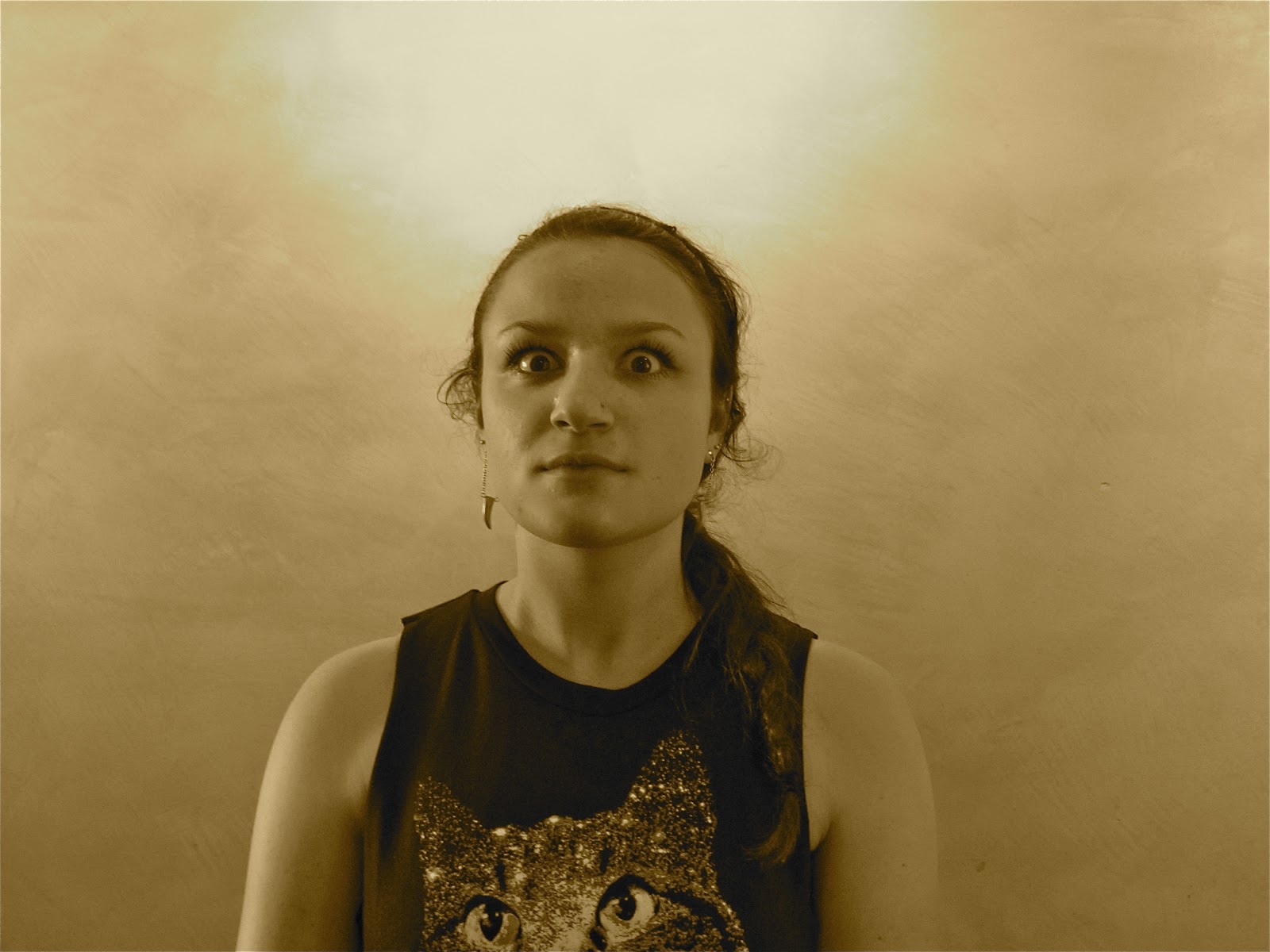
This photograph is one of my favorites, which is why i ended the collection with it. Before i even put this photo together, I had a very clear image of what I wanted it to look like. I set up a timer and took many pictures until I decided i had the right shot. Although i wish i had taken the background photo, i was not able to find another photo i had taken that could make this photograph as successful as i wanted it to be. So, i took this colorful photo from Google and edited it to be black and white, boost the color, darken it, and blur corners and aspects of the trees. I edited myself into it and positioned myself so that i appeared to be sitting on the rocks. I blurred the outline of my body so that I looked more realistically in the photo. I like that this photo is very solemn, similar to the work of Sally Mann.

Wednesday, October 24, 2012

MACRO

 The mural behind the figure was actually from a photo I was in. I placed my photo in front of me so that it looked the same size as a person would look in the photo. The sepia affect in this photo also made the figure look proportional to the mural and as if it were taken at the same time.
 I actually took the background photo in Hawaii, when I was visiting a waterfall. I initially wanted my figure to be standing on top of the branch, which was hard to achieve. Instead i measured where the hands would be in proportion to the branch and then held it to make the figure look like it was hanging on the tree. The angle of below the figure made it seem bigger and also more personal. This reminded me of a sci-fi movie.
In this photo, my figure is looking at a photograph or an old movie. I took one of my photographs that you can only see when placed in front of a light. I put it in front of a bright computer. I like this photo because of the position of the figures arms.

 This is a very simple photo, but i like that the wood is still very detailed. The position of the figure looks like something a person would do, and i like how the string looked in its arms. This is not the strongest photo, but it does make my figure look more life-like.
 I took this photo in the Galapagos. I wanted to place my figure next to the turtle, or running away. That was hard to do because the figure wasnt already in the photo, and it didnt look believable. I placed it "behind" one of the trees so that it almost looked like it was hiding from the tortoise.
This photo was also taken in the Galapagos. I held it by the legs and put it in the position before putting it in front of the computer. I took is from the angle of the side of the figure. I like how believable this photo is and how the figure really looks like it is laying in the hammock.

Monday, October 15, 2012

PORTRAITS

My goals of this photo was to make Benji appear annoyed. I gave him examples of things that might annoy him, and asked him to try to show it in how he held his face, not just in an obvious pose. I also edited this photo to look slightly darker.

In this portrait, I asked what Eva would look like if she was mad. Again, i didn't want her to model the typical mad pose or face. I love the expression in her face, and the way the emotion affected how she held her body. I also noticed how full her lips were, so i edited the photo a little to brighten the redness in her lips and her shirts.

Hao appears confused in this photo. The most important part of this portrait to the emotion I asked him to portray is the lines and the position of his eyebrows. This aspect is what makes Hao look confused, even though it is more subtle. I enjoy that he does not look 100% confused because it makes you search the photo more.

In this photo, I gave Emma the emotion of scared. This is not necessarily how i would show that i was scared, which gives this photo a more unique quality. I also edited the photo to be Sepia, instead of black and white which reminds me of an old horror movie. I like the effect of the coloring and the way Emma changed her eyes and the stiffness of her face to show herself being scared.

This portrait is of Sophia looking concerned. I wasn't sure how to edit the background out from my computer at home, which would have completed the picture more. I can't see what exactly makes her look sad, which makes the photo much more interested. I think she captured the emotion very well.

In this portrait, I asked Jacob what he would look like if he was being shy. I thought it created interesting angles of his face when he tilted his head down and tucked in his lips. I also edited this photo so that it was black and white and there was more contrast.
My goal of this portrait was to have Neff look flirty or happy. The way she tilted her body and smiled portrayed flirty very well. I think this is an overall pleasing photo, and while not the most interesting photo, it shows the emotion i was looking for.

I know this is not what the assignment was, but i also wanted to do something different with it. I looked at the most intriguing parts of the faces in each photo, and blended each of those parts into one photo, or one person. It doesn't match perfectly, but i liked the idea of it and that it would look extremely different from all my other photos, and everyone else's.

Sunday, September 30, 2012

LIGHT PAINTING


As people were taking pictures of light painting using the flashlight, I also wanted to do something different. I noticed that the blinds on the door had a line of little wholes, where light entered the room. I took a picture of the blinds and moved my camera around to create the same movement as the flashlight, with a very different effect. 
 I went to the front of the room to look at the colors that has been used for the light painting with the flashlight. The flashlight was creating a reflection on the plastic that made the colors pop more. I lined up certain colors and rested the flashlight on them and took a picture, moving the camera slowly. The colors aren't so bold in this photo, but fade into each other.
 While photographing the light painting, I noticed that the slow movement wasn't quite as interesting as the fast movement. So, I started out slow (the more delicate wave in the middle), and started to move my camera so that it made lines and shapes across the page. I like the geometric aspect in this picture.
For this photo, i was, again, searching for something that would be different than the rest of the photos. The shades covering a window didn't touch the ground, so there was a line of light at the bottom. There was also a chair in front of the window, which meant that the light only entered the photo in certain places. I moved my camera a little so that there would still be motion in the picture.

Saturday, September 29, 2012

BLUR

 Definition is present in this photo of a keyboard, even though it is blury. It is almost as if the keys are moving, which making the keys start to blend into each other.
 This photo is almost as if I took a photo of the classroom, and then added a picture of the people. The background, or walls of the classroom, are apparent even though there are people in front of them. The lights in the room slowly blend into the white ceiling, so that the light looks even bigger and brighter than it was.
The photo, in my opinion, looks as if I were in a car and took a picture of the scenery. I love that it appears as if Drew and the church are moving.
I decided to experiment with a tissue and see how it would turn out. Even though its all white, there's tons of shading in this photo. Also, even though this isn't necessarily of an object someone would easily recognize, the picture still appears blurry.

Thursday, September 20, 2012

REPETITION

These three marks in the ground are similar in shape and color and give a sense of repetition that is more natural.
None of these pennies are exactly alike, so that they create an interesting pattern. The angle of this photo is also an example of leading lines
This repetition is in the form of a column, which is different than most of my other photos that are items in a row. I also like that you can see a little of Cortland and my reflection.
The coloring and shadowing in this photo interests me. The colors pop out compared to the plain desk. Also, the desk is light on top of the skittles, and after the skittles is more darkness. The skittles are also an example of repetition in a row.

The stairs are a less obvious form of repetition, but the white lines are the same. The lighting in this picture also appeals to me.

FOREGROUND BACKGROUND

In this photo, the details in my backpack are very clear and defined and the background is blurry, playing into the foreground/background theme.
Even though the background of the church isn't necessarily blurry, the lighting and the details in this photo make the church and sky the background, and the gate the foreground.
The details in the leaves are exagerated, as well as the spots in the concrete, which plays into the theme of forground and background. The colors of the leaves reminds me of fall.
.
I love that you can see the etchings in the wood, and that it is also an example of leading lines. The white door is blury, and the hinge adds a more interesting aspect to the background.

Wednesday, September 12, 2012

LEADING LINES & PERSPECTIVE


The plants are extremely defined and play into the leading lines with the brick wall. The coloring is somewhat faded which adds a calmness to the photo.
In my first picture, I found the lines on the cabinet to be appealing. The etchings of the wood are artsy and the lighting creates interesting shading on the handles. 

 In this black and white photo, the buildings become smaller as they become farther back. The shadow of the pole is also interesting since it, in addition to the buildings, becomes smaller as it goes farther from the base.
I like how defined the birds are in this picture and that they become smaller, as well as more blury.
 In this picture, the wood is very defined and each piece of wood is an example of leading lines. I also like the coloring and effects in this photo.
 The lockers are an excellent example of perspective. Also, you can see that even though the framing for the photo is the same, I become smaller as  i step back in the room.
The brick wall is an example of leading lines, as well as the telephone poles. Both are subtle changes, but become smaller in the distance. I found that this is also a good rule of thirds.

Thursday, September 6, 2012

RULE OF THIRDS

This photo is simple yet the folds in the origami crane and the wood adds more depth. These are very warm colors, which appeal to me.
The towers are the same and are in the first and third sections of the photo. I also like the use of negative space in this photo.
The stairs go extremely well with the rule of thirds. The lines within the stairs play well into this assignment.
My shirt, stomach and jeans play into the rule of thirds in a less obvious way. My hair also takes up a column of the photo.
This photo uses the rule of thirds through columns and rows. The colors of this photo are very pastel and cute, while some of the pins are off. I like that the pins are not set up perfectly, which creates a cute and still interesting picture.
The windows in this picture plays into the rule of thirds. The buildings behind Drew also apply. The blinds add a cool texture to this photo.
This candle is split into thirds (the base layer for the 1st and 3rd row and the string for the 2nd row).

This was taken in hawaii and i thought it was another good example of using the perspective of the camera pointing up.