Wednesday, March 13, 2013

PORTRAITS

This portrait is of Cortland. I darkened it and put it in black and white. I also layered it with a close up of his face, smiling.

For this photograph, I layered a pretty picture of Eva smiling and posing with the camera and Eva looking down. This is the most delicate photo in this collection.

This photo is kind of creepy since i darkened it and layered it with the same photo to give it more movement.

I layered these two photographs of Grace to show more than one angle of her face. I also edited this photograph by putting it in Sepia effect and fading the color.

This photograph of Oren is one of my least favorite. I copied and cut out his jacket, and pasted it into the photo, right next to him. This was a less successful experimental portrait.

This photograph shows a lot of movement of Jacob. I layered the same photo four times, and make the original position the darkest, and make it fade as he went higher and higher into the photograph.

This is also one of my least favorite. I experimented a lot with cutting and pasting the lockers, and i also tried to give this photograph a bit of a destroyed look. I am not extremely pleased with how it turned out, but it shows a process.

For this photo, i cut out and pasted the word "Nike" several times, and lined them up on the bottom. This photo is more simple, but i love that his face shows so much emotion.

I also love this photograph of my friend. I darkened it and put it in an effect, and layered it to the side so that you could still see her whole face, but it looked really different than all the other photos. This is the only really close up one of a face. 

I layered two of Rose's poses to show more movement and different angles of her face, similar to Grace's. I also darkened this photo and put it in black and white effect.

Thursday, February 28, 2013

PLAN


For this project, I am going to portray emotions and for some photos, stories by layering photographs of people. I have not decided whether these photographs will be black and white or not, but these photos will be simple and use negative space. The emotion shown in this collection will be similar to Ansel Adams, but some will also portray a likeness to Sally Mann's photographs of her children.

Thursday, February 21, 2013

NATURE/BODY PARTS

I took this close up photo of Eva's eyes because i think that eyes are a really beautiful facial feature that can say a lot about a person. Her lashes are very long, and i edited it so that one half of her face is darker than the other.

I layered a photo of a chest and collar bones with a photograph of dandelions. I decided to layer these photos because both are somewhat delicate, and also the skin is a more simple photograph that becomes more detailed with the dandelions.

Again, I really enjoy photographs of eyes. I edited this photograph so that it was more focused on Cortland's eye. 

This photograph was taken in my Grandmother's house. It is not a body part, but i put this photo in this collection because it includes the nature/plant part and many of the shapes are similar to other objects in this collection. For example, the plates are the same colors as eyes. I like the coloring in this photograph.

I layered these two photos so that it becomes very complicated. It is hard to tell what is in this photo at first, but it is a hand and a palm tree. I also edited this photo to make it darker and i made it in Sepia effect, but faded it so that there wasn't much color.


I took this photograph of skin when the person had goose bumps, and I love how simple this is but it is still an interesting subject. 

At first, this photo was a joke, but i grew to enjoy it. A neck is a weird thing to take a picture of, and not many people would think of that. That is why i decided to include it in this collection.

I also put this photograph in Sepia effect, and faded it and darkened it so that it did not have much color, but also showed more depth. I like that the fingers aren't perfect, and you can see where the nail and skin has been picked at.


I took this photograph on a walk. The plants are all going in different directions, which creates interesting perspective.

This photograph is of a belly button. It looks really different when it is not in context with the rest of the body. I darkened it so that only parts of the belly button could be seen. 

Wednesday, February 13, 2013

PLAN

1. I will finish what i started with the last assignment and take pictures of body parts and, if people are comfortable, features that people are insecure about. I think that this will be a very interesting project, even though it might mean taking more time.
2. I am going to take pictures and layer two at a time. I will either do two really similar photos except slightly different to create motion, or just choose two that create contrast or go very well together. I might want to focus on combining portraits/people and plants/nature, but i might decide to do other things as well.
3. For the third project, I would like to focus on minimalistic/simple photos all of food. I will make the pictures of food look more simple by making the brightness really high so that it appears a lot more delicate. The colors in these photos will also be more pastel, or just one bright color. I love taking photos of food so i think i will enjoy this project a lot.

Thursday, February 7, 2013

NEGATIVE SPACE

I used a chair for the foreground of this photo so that only part of the background actually showed up in the picture. I darkened this photo and put it in black and white to add more of a city or dark feeling. 

This photograph was taken on the way to school. I enjoyed the shapes and the negative space the domes created, but i didn't want to include the entire building, so i allowed the photo to primarily be taken up by the sky.

In many of these photographs, I was just playing around with angles and how certain pieces of furniture interacted or affected the view. This negative space created by the blinds is more detailed. I put this photo into Sepia affect, and in order to make it a little darker, i turned down the saturation. 

This photograph was taken in a darker room. I cropped the photo so that you couldn't see quite as much of the wall. I like how the shades make the photo so much more geometric. I also darkened this photo and put it in black and white. 

I took this photo on my way to school, and i like that, even though the bottom of the photo is not black, there is still negative space. I also put this photo in Sepia effect and turned down the saturation so that the color of the ground was less prominent than the color of the sky.

The foreground of this photo is a chair with an elaborate design. The background is still the city, like all my other photos, but you can basically only see the one building. The negative space in this photo is very detailed because of the design.


This photo was taken on Geary street, of another Church. The color of the church and the other building were much more bright, but i turned down the saturation and the brightness so that I did not have to put it into a black and white or sepia effect. 

This photograph was taken near Union Street. The geometric shapes of the building on the right lead the eye to the center of the photo, where the clouds stop. There is also a lot of perspective in this photograph with the buildings getting smaller as they go into the distance. I lowered the brightness and the saturation so that the sepia effect was not as bright.


Friday, February 1, 2013

SUNSETS

This photo was taken coming back from a volleyball tournament. The contrast of the city and the sunset in the sky makes the photo look bolder, and i like the added movement of ropes on the bridge. 

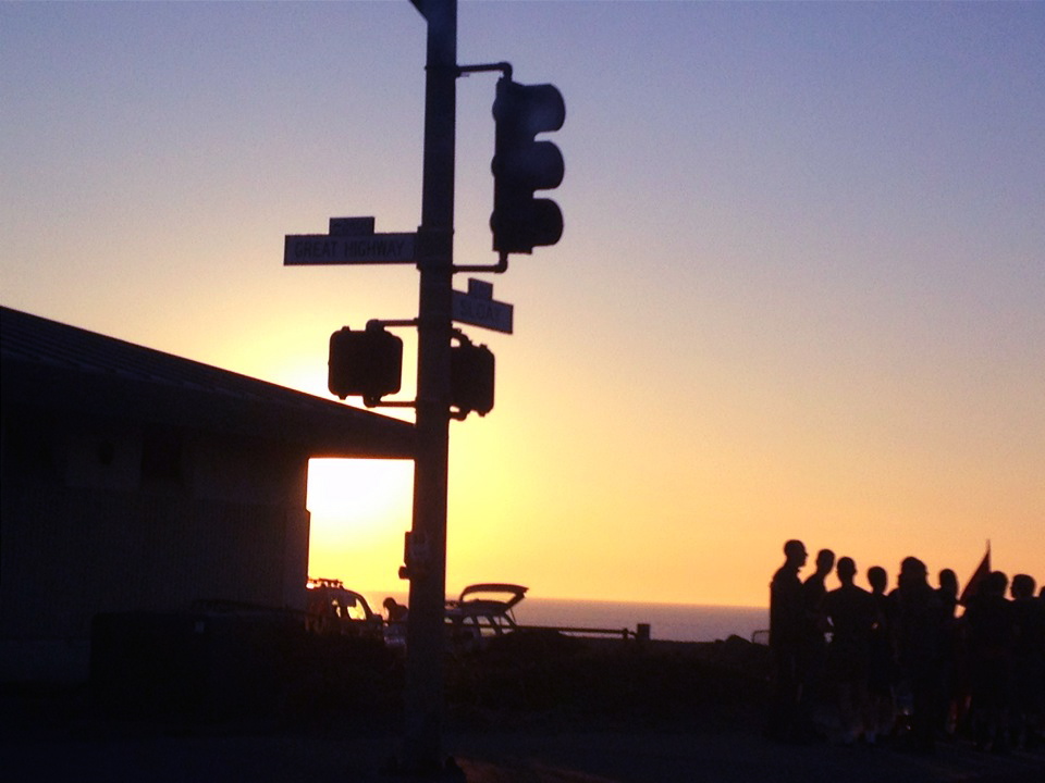
 I pass by the beach every day, which is great opportunity for sunset photography. I chose this photo because of the group of people, which gives much more to look at in this photo than just a sunset. This photo was very yellow before, so i added more sharpness and contrast to make the sun stand out, and i changed the coloring to more pink and blue.
 This photo was taken in the city. I was walking to my friend's house when I noticed the beautiful view and the sunset. I love the perspective of the houses getting smaller, the ocean in the background, and the telephone polls running from the middle of the photo to the side.
 I love the use of negative space in this photo, and that you can see the sky more and more through the trees until you get a small view of the ocean and the sunset. I also edited this photo to make it sharper and made the blue coloring brighter so that the sky was more visible even with the trees blocking some of the view.
I think that this photo was taken actually on the way to school. We had to go to school earlier that day, so the sun was just rising in the sky. I'm always amazed when clouds turn pink in a sunset or sunrise. I also like the NE in the mirror that is brought out more with the blue in the sky. I like that it is apparent the photo was taken in the car, because it makes the photo feel less set up.

There isn't anything in this photo that is specifically different, but i love the coloring in this photo and the amount of ocean and hill that i put in the photo. I brought out the pink and blue in the photo, similar to my editing technique in the other photographs. 

This photograph is different than the other ones because it is primarily documenting the blue sky, without anything interrupting that scenery. The ocean is at the bottom of the photo, with a hint of pink fading into the light, but deep, blue sky. 

This photo was also taken while going to school, and passing by the beach. I like that you can see the construction work, and that there is also a mountain in the back ground. It is very small, but there is  also a little ship in the background. I like the soft coloring of this photo, which was also a theme in my other photos. In all the photographs, i attempted to make a them softer and added to the brightness of the pink and blue coloring.

Tuesday, January 22, 2013

WORDS

This photograph was taken in the Galapagos. I loved the coloring of the house, how the paint faded away, and the gate on the door. This house and my trip in general made me feel extremely privileged to live in San Francisco, which I usually take for granted, which is why i added "be content."

 I also took this photo in the Galapagos, on a hike. It was an amazing, more natural sculpture carved out of a rock. This work of art captured in this photograph shows that art can also be made in more natural ways and in nature.
 I like this picture of my friends, taken in Santa Cruz. I chose the word "look" because most would look directly at the people. However when you take a closer look, you can see a large ship and tons of people in the background.
I added the word, "bother," to this photo because most people think of mushrooms as annoying or in the way, but they can also be very beautiful. Like all my other photos, I enjoy more simple and subtle editing. I also gave this photo more of a feel of motion, since the photo itself isn't completely focused, and the words are a bit blurry.

I took this photo in Missouri, on a community service trip with my friends. This was a picture of stairs leading up to one of the ruined, deserted houses from the Tornado in Joplin, Missouri. The peoples belongings were sprawled all over the demolished house and ground, and yet i found it amazing that there were some beautiful antique eggs that survived. This trip and this photo were very inspiring, so i chose the word "Prevail," because the people of the town's lived were basically destroyed, yet they were determined to survive.

This photograph was also taken in the Galapagos. I chose the word "beauty," because I thought that word depicted the clovers. In black, above beauty, i added the word typical. Four-leaf clovers are always photographed and are now a more typical beauty. So, i decided to document their beauty but also how they are repeatedly used. 

Elephants are amazing creatures, and in my opinion, beautiful. I thought the baby elephant standing with its mother was adorable, and i like the simple coloring of this photo. I added the word "wonder," since there is a baby elephant and there is a wonder of what that elephant will grow to be, and I also wonder about the elephants and their lives in general.

This was at a zoo in San Diego. I loved and edited the contrast between the dark dirt and the light flamingos. I think the ripple in the water adds to this photograph. I added "differentiate" because people  think of each flamingo as the same and that they all look the same, and it is important for people to differentiate themselves, unlike flamingos.

This photograph was labeled with the "Drift" since there is motion in the photo which is similar to drift. I thought drift was also more appropriate because of the landscaping which makes me feel like i could drift into the sunset.

This photo was taken from my Sally Mann collection, and i added "wander" to this photo because the path looks endless and like one could easily explore, or wander, in this forest. 


Thursday, December 13, 2012

SALLY MANN

 Of all the landscape photographs emulating Sally Mann's later work, this is my favorite. This photo was taken this summer, in the Galapagos, on a hike. The previous version is significantly different than this edited version because it was so colorful and bright. I added a Sepia affect, boosted the color, and blurred one half of the photo so that this photograph looked similar to Sally Mann's work.
 Although this photo is much brighter and perhaps simpler than Sally Mann's most famous work, there are still many similarities. Sally Mann mainly focused on photographing her family and children doing every day things. In this photo, I am doing Parvin's hair, which is also more casual. I like that we are not looking directly at the camera, even though most of Sally Mann's portraits of her children were looking at the camera.
 This landscape photograph was taken on a hike near my hour. I love the movement of the clouds in this photo, and how, even though the trees are in the center, there are a few more focal points. I also edited this photo to be black and white, and blurred the photograph to emulate Sally Mann's style of dark and imperfect landscapes.
 This photo was a very long editing process and emulates the work of Sally Mann that focused on faces. There are a few of her photos that only show one part of the face, for example the mouth or nose. I took a close up picture of the models skin, blurred it, and set it as the background. I then photoshopped only her mouth onto the skin background and blurred the edges so that it mostly blended into the background. I then clipped the outline of the tree and pasted it onto the background to make this photograph more complex.
 This photo is somewhat similar to the previous photograph of me doing Parvin's hair. Doing hair is an everyday event, and I like how Neff's hands look while she's braiding her hair. I darkened and edited the coloring of this photo so that it looked similar to the coloring and definition of Sally Mann's photographs. I also blurred the background so that the eye would mostly just notice Neff.
 This photograph of Eva at the top of a staircase does not emulate a specific photo of Sally Man, but I like how the lighting in the photo bounced off the walls, and, even though you can't see Eva's facial expression, she looks mad or alone. Anger or loneliness is a pattern in Sally Mann's earlier work.
 This photo was taken near my house. Before editing this photo, there was a beautiful sunset that made the trees appear black. The colors of the sunset did not show through with my edits, which makes the photograph more mysterious because the viewer may not be able to tell if it is day or night. I also blurred parts of the tries so that it looked more mystical. The blurring is not perfect, which i decided to embrace, similar to Sally Mann's perspective of imperfections in a photo.
This photograph is one of my favorites, which is why i ended the collection with it. Before i even put this photo together, I had a very clear image of what I wanted it to look like. I set up a timer and took many pictures until I decided i had the right shot. Although i wish i had taken the background photo, i was not able to find another photo i had taken that could make this photograph as successful as i wanted it to be. So, i took this colorful photo from Google and edited it to be black and white, boost the color, darken it, and blur corners and aspects of the trees. I edited myself into it and positioned myself so that i appeared to be sitting on the rocks. I blurred the outline of my body so that I looked more realistically in the photo. I like that this photo is very solemn, similar to the work of Sally Mann.